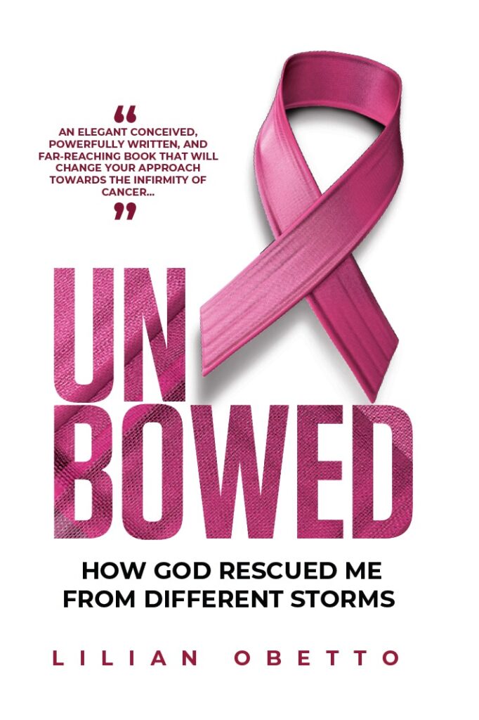
Summary: The ribbon communicates what the book will be about. There is good use of font and text. Colour blend is also very good.
(i) The cover is clean, well designed, balanced, and has proper use of white space. There’s a good choice of fonts and messaging. Here, an eye was given to the design, which went beyond the symbol of cancer.
The design has used the common cancer image/symbol. But more than that, it is how it has been designed and aligned to the titling that makes it go beyond cliche use of it. In my view, it is well executed.
(ii) The titling has followed the order of threes – Title, Subtitle and Author – each is differentiated enough to play its role.
The use of the order of threes in the titling not only adds a sense of balance and harmony to the overall design, but also creates a memorable and cohesive visual experience for potential readers. The careful differentiation of each element ensures that each component fulfils its specific purpose of capturing attention and conveying important information about the book.
The design flows – it is a proper funnel yet distinct enough not to lose the Title, Subtitle and Name of the author: None swallows the other and none competes with the other. They are complementary. The design clearly shows use of professional software/app.

(iii) There is a keen balance between titling and image. This includes the choice of pink colour used to show the connection to breast cancer awareness. The cover’s use of vibrant colours and striking imagery immediately grabs attention and piques curiosity. It successfully conveys a sense of hope and strength, making it an enticing choice for readers looking for an inspiring story.
The subtitling adds depth and intrigue to the overall design. The cover’s visual appeal and thoughtful design elements make it a powerful tool for spreading awareness and capturing the interest of potential readers. It stands a high chance of standing out in a pile of other books in a bookshop or library.
(iv) The design is easy to the eye – nice hierarchy, colour choice, and proper use of what we call in design – the white space.
The white space in the design allows for a clean and uncluttered layout, allowing the reader’s eye to easily navigate and focus on the important elements. This attention to detail in the design enhances the overall reading experience and reinforces the professionalism and quality of the book.

(v) The contents of the cover are well distributed, and I liked the idea of filling the title with the texture of the ribbon. The texture of the ribbon adds a tactile element to the cover, making it visually interesting and inviting to touch. It also creates a sense of elegance and sophistication, further enhancing the overall aesthetic appeal of the book.
In addition, the use of the ribbon texture not only adds visual interest but also symbolises the journey and challenges faced by the protagonist in their battle against cancer. This subtle yet powerful design choice effectively captures the essence of the story, enticing readers to explore the book further and discover the inspiring narrative within.
(vi) The cover engages the audience by a look. It communicates that the content is about life/biography especially through the subtitle – and yes you can easily tell it is a cancer story by the subtitling lending it a journey motif.