
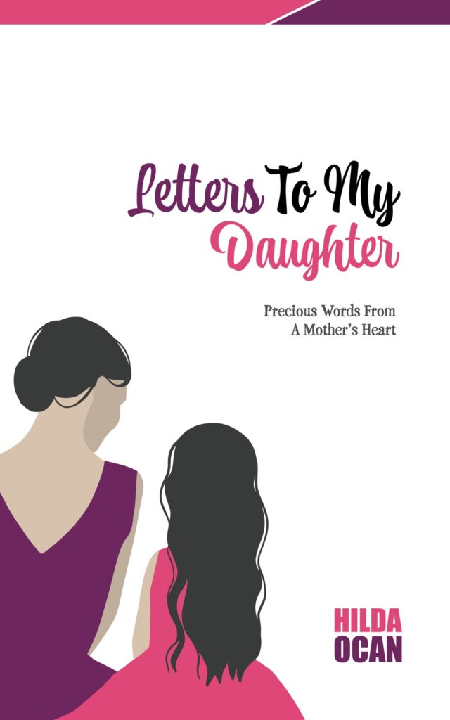
Summary: The book cover of Letters To My Daughter – Precious Words from a Mother’s Heart by Hilda Ocan is a beautiful and captivating depiction of a mother’s love.
The cover art showcases a delicate closeness between a mother and daughter, symbolising the tender care and nurturing that a mother provides to her daughter. This makes the cover an enticing visual representation of the heartfelt messages that await readers inside.
This captivating illustration sets the tone for a touching and inspiring read, reminding readers of the profound bond between a mother and her daughter. In addition, it is anticipated that as readers delve into the pages, they will be transported into a world where love, understanding, and support are celebrated, leaving them with a renewed appreciation for the special bond between mothers and daughters.
The vibrant and soft colour palette of pink, purple, and white immediately draws the reader in, creating a sense of warmth and affection that perfectly mirrors the heartfelt words within the book. The use of pastel hues further enhances the overall sense of tenderness and love portrayed in the cover, making it irresistible to pick up and explore further.
The intricate details in the artwork, such as the simple monochrome and flowing dresses, add an element of elegance and femininity, capturing the essence of the mother-daughter relationship beautifully.
The cover’s visually appealing design not only captures the eye but also invites readers to delve into the pages and experience the powerful emotions that lie within the mother-daughter conversation.
The playful font used for the title and subtitle invites a child into the conversation.
The use of a playful font for the title and subtitle adds a touch of whimsy and invites young readers to engage with the story.
This clever design choice creates a sense of inclusivity, allowing children to feel like active participants in the mother-daughter conversation. It adds a sense of accessibility, making the book feel approachable for readers of all ages.
The cover not only draws children in but also supports the notion that everyone can enjoy mother-daughter conversations.
The cover has a balanced use of white space and vibrant colours, which creates a visually appealing and eye-catching design. This balanced use of white space allows the title and subtitle to stand out, making it easy for readers to identify the book and its theme.
Conclusion: Overall, the cover design effectively captures the essence of a mother-daughter conversation while also appealing to a wide range of readers.
Published By Leap Publishers, UG
Leap Publishers is an African-Christian Publishing House helping authors and content creators develop and produce high-quality, life-giving written works that will transform the lives of all who interact with it.
Founded on their key values of faith, excellence, equality and truth, they work hard to ensure that the African-Christian content they produce carries a substance and quality that can change the world with God’s Truth. For more information, visit them on facebook (www.facebook.com/leappub) or their website (leappublishers.com)