
Teteyian Nangurai Teteyian Nangurai is a storyteller at heart, driven...
Read More


Monica Mueni
Monica Mueni MSc holder in Agricultural Economics, Benguet State University,...
Read More
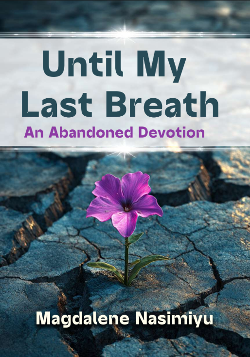
Magdalene Nasimiyu
Magdalene Nasimiyu is a passionate follower of Christ, mission leader,...
Read More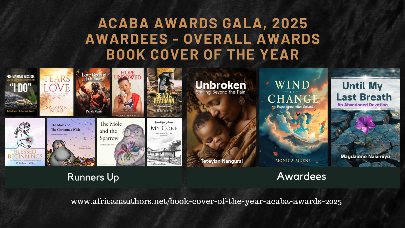
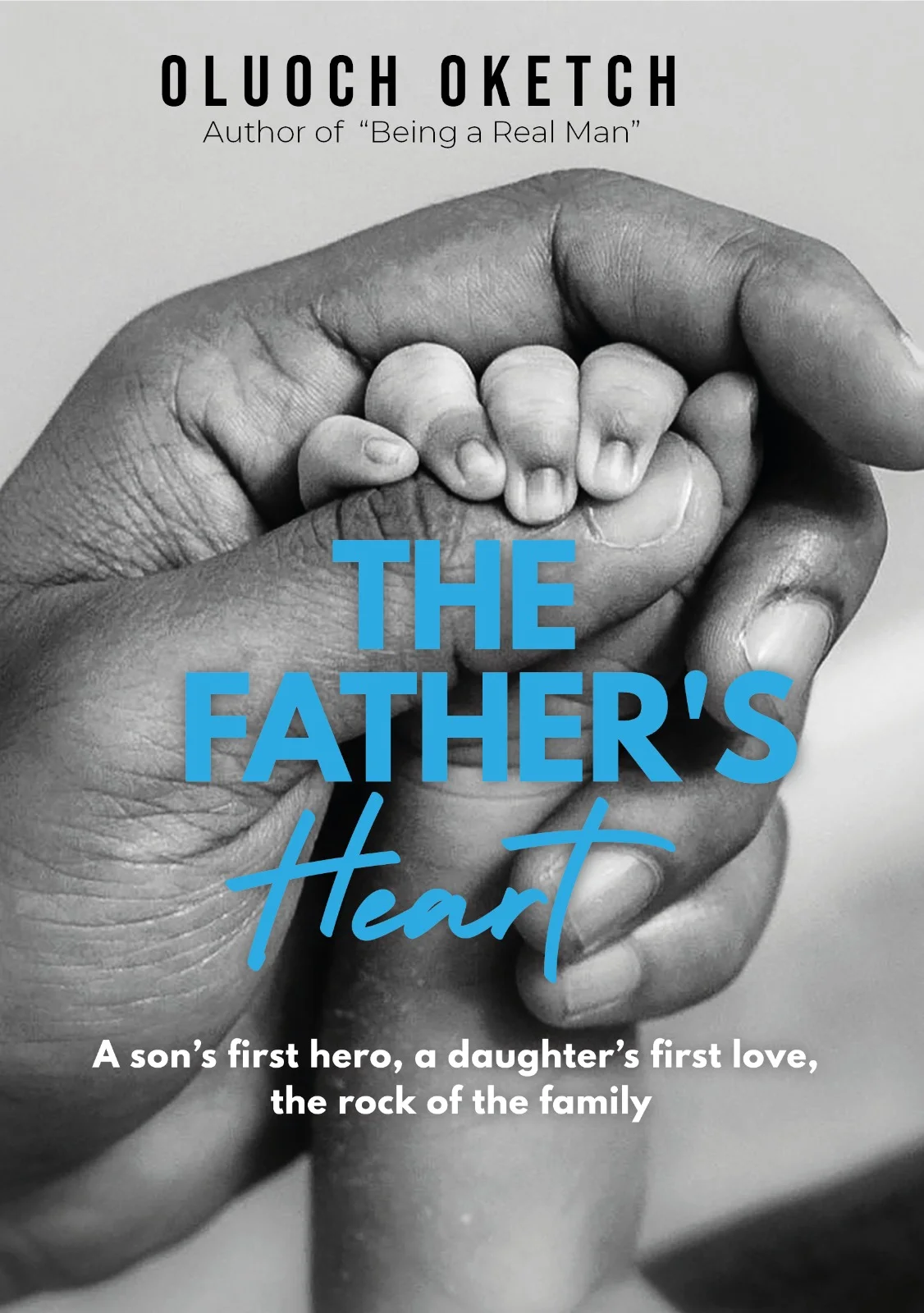
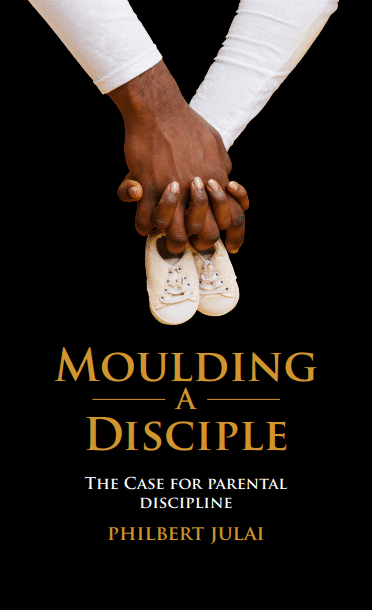
Book Cover of the Year 2025 - Top Cover (tie)

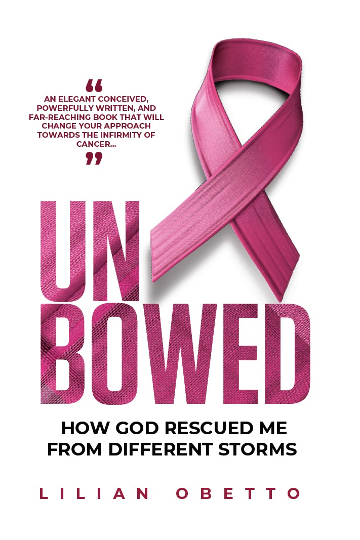
Book Cover of the Year 2025 - Top Cover (tie)

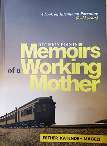
Book Cover of the Year 2025 - Top Cover (tie)

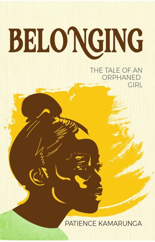
Book Cover of the Year 2025 - Runners Up (Tie)
Book Cover of the Year 2025 - Runners Up (Tie)

Book Cover of the Year 2025 - Runners Up (Tie)

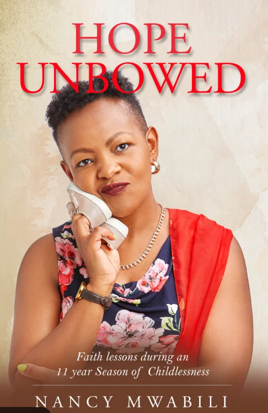
Book Cover of the Year 2025 - Runners Up (Tie)

Book Cover of the Year 2025 - Runners Up (Tie)

Book Cover of the Year 2025 - Runners Up (Tie)

Book Cover of the Year 2025 - Runners Up (Tie)

Book Cover of the Year 2025 - Runners Up (Tie)

Book Cover of the Year 2025 - Runners Up (Tie)


Monica Mueni
Monica Mueni MSc holder in Agricultural Economics, Benguet State University,...
Read More
Magdalene Nasimiyu
Magdalene Nasimiyu is a passionate follower of Christ, mission leader,...
Read More

Book Cover of the Year 2024 - Top Cover (tie)

Book Cover of the Year 2024 - Top Cover (tie)

Book Cover of the Year 2024 - 1st Runners Up
Book Cover of the Year 2024 - 1st Runners Up

Book Cover of the Year 2024 - 1st Runners Up

Book Cover of the Year 2024 - 2nd Runners Up

Book Cover of the Year 2024 - 2nd Runners Up

Book Cover of the Year 2024 - 2nd Runners Up
Book Cover of the Year 2024 - 2nd Runners Up

Book Cover of the Year 2024 - 2nd Runners Up

Book Cover of the Year 2024 - 2nd Runners Up

Book Cover of the Year 2024 - 2nd Runners Up


Book Cover of the Year 2023 - Top Cover (tie)

Book Cover of the Year 2023 - Top Cover (tie)

Book Cover of the Year 2023 - 1st Runners Up

Book Cover of the Year 2023 - 2nd Runners Up

Book Cover of the Year 2023 - 3rd Runners Up


Book Cover of the Year 2022 - Top Cover (tie)
Book Cover of the Year 2022 - Top Cover (tie)

Book Cover of the Year 2022 - Notable Mentions

Book Cover of the Year 2022 - Notable Mentions


Book Cover of the Year 2021 - Top Cover

Book Cover of the Year 2021 - Notable Mentions

Book Cover of the Year 2021 - Notable Mentions
Book Cover of the Year 2021 - Notable Mentions

Book Cover of the Year 2021 - Notable Mentions

Book Cover of the Year 2021 - Notable Mentions

The George Verwer Legacy Award for Program of the Year
The George Verwer Legacy Award for Program of the Year Written . Published . Impacting The George Verwer Legacy Award for Program of the Year Named after George Verwer, the founder of Operation Mobilization and a champion for innovative ministry programs, this award acknowledges the ACABA program that most effectively…
Read MoreThe Kenneth N. Taylor Legacy Award for Book Cover of the Year
The Kenneth N. Taylor Legacy Award for Book Cover of the Year Designed . Published . Communicating Welcome to The Kenneth N. Taylor Legacy Award for Book Cover of the Year, honouring the profound legacy of Dr. Kenneth N. Taylor, founder of Tyndale House Publishers and the visionary behind The…
Read More
The Ken & Bessie Adams Legacy Award for Content of the Year
The Ken and Bessie Adams Legacy Award for Book Content of the Year Written . Published . Impacting The Ken and Bessie Adams Legacy Award for Content of the Year Named after Ken and Bessie Adams, founders of CLC International, whose work laid the foundation for accessible Christian literature worldwide,…
Read More